"I am a painter who expresses a peaceful and light atmosphere through painting, and I have a high regard for this concept."-Giorgio Morandi
Morandi's history of growth
Giorgio Morandi (1890-1986) was born in the small Italian city of Bologna and studied and taught printmaking at one of the highest institutions of art education in Italy, the Academy of Fine Arts in Bologna. Morandi never married and lived most of his life with his three sisters in a modest apartment in the small town of Bologna.
Even in the changing world situation of the 20th century, he did not yearn for the outside world in a small town, he said, "even if a person goes around the world, it may be nothing." To increase awareness, don't look at too much, but look at what's right in front of you."
Early works by Morandi
Even though he never left Bologna in his life, Morandi's search for artistic nourishment covered the Tuscan school of painting from the 14th to 16th centuries, the great masters of the Renaissance, the futurist style born in Italy, and the works of Cezanne, Derain, and Picasso at the heart of the art world. He also experimented with cubism and futurism.

《Trigonometric and metaphysical still life》
Cubism style revealed
Among them, Piero della Francesca, the representative painter of the 15th century frescoes, used heavy cream white and light brown pigments, as well as the bright texture of the paintings, which Morandi has well inherited in his own paintings.

《head of an angel》
Minimalist aesthetic style
Since then, he has become increasingly concerned with tonal changes and subtle layers between objects, which are hidden in the uniform gray mist tones, and also established the direction of his painting style - a minimalist aesthetic style that combines Italian artistic traditions with modernism.

《1920 Pinacoteca di Brera, Milan》
The origin of unique colors
When Morandi found the bottles, he would also paint them, let the dust build up, and then paint them. To accurately depict these dusty still lifes, each color in Morandi's paintings is a blend of three to five colors (red, yellow, blue, black, and white) rather than a single color block. It is this multi-layered complexity of color that makes Morandi a well-deserved color master.
As a result, all the objects in his paintings seem to be covered with a layer of calm and elegant tones. The color in tune brings harmonious beauty, creating a timeless, hazy beauty.

《still life 1956》
So, how to achieve the ideal effect of Morandi color system in design and color matching? We have summarized the following rules:
# Reduce color saturation
Add gray and white tone to the commonly used colors, so that the color sense of the whole picture is restricted by each other, the overall average, and the visual balance effect is achieved.
Charlotte Taylor, an architect and artist from London, uses the soft colors of the Morandi palette to deconstruct the inner structures of house buildings, turning them into beautiful blocks of minimalist color.

# Use intermediate colors
Choose adjacent color matching or the grayer middle color in the same color system, you can make the color matching do more, without chaos.
Swedish painter Einar Jolin used clean, comfortable Morandi colors to depict cold and warm Nordic landscapes, with many colors in nature, but the overall feeling is pure and fresh.

# Avoid making the overall picture too dark
The essence of the Morandi color of the advanced color is to reduce the color purity, rather than lose the color, leaving a cold temperament.
In the home collocation, the proper use of Morandi colors, such as gray pink, haze blue, elegant green, nude brown and gray home accessories, enough to convey a peaceful self-holding, soothing elegance, warm and warm atmosphere.

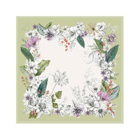
The corresponding can be derived from the Morandi scarf, the Morandi scarf can bring us what?
1.Create peace and comfort :
Because of its low saturation and soft tones, Morandi can give people a relaxed and peaceful feeling, and Morandi gives people a warm feeling.
2.Classic out of date:
The low saturation color has a high classic and permanence, and is not easily affected by fashion trends, maintaining the long-term charm of the design.
3.Easy to match:
Because of its soft characteristics, Morandi scarves can be easily matched with other colors, whether with a similar low-saturation color coat sweater skirt, or with a neutral color waistcoat, can present a harmonious visual effect.